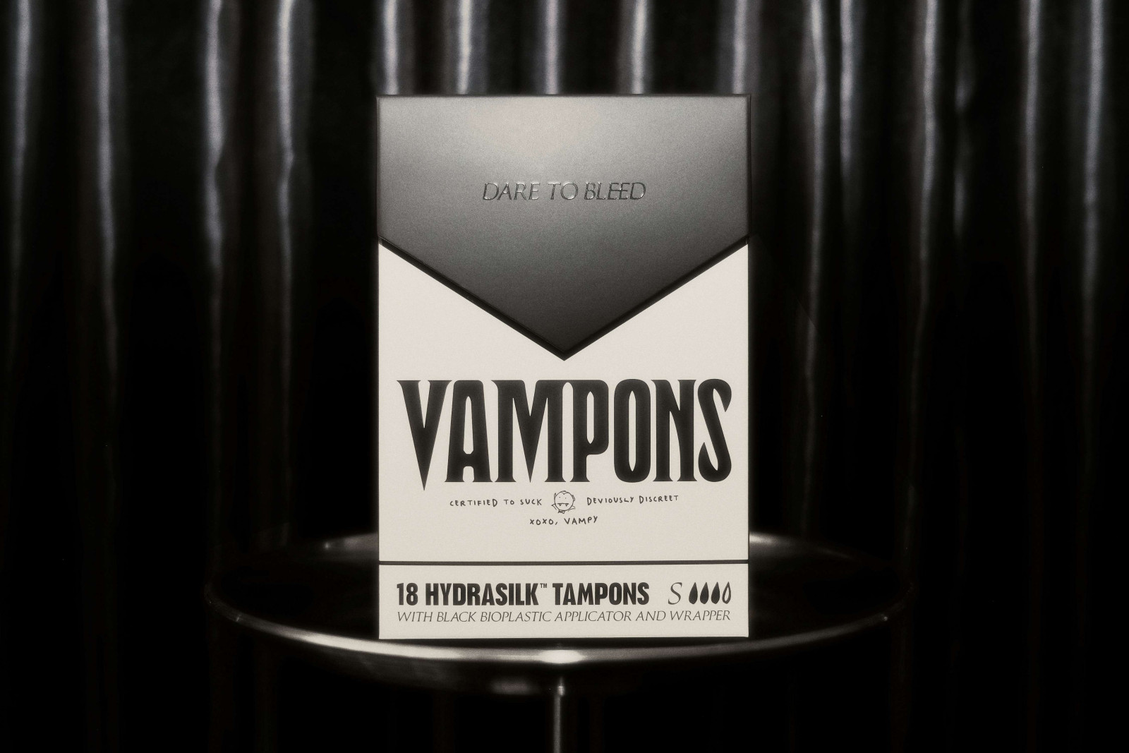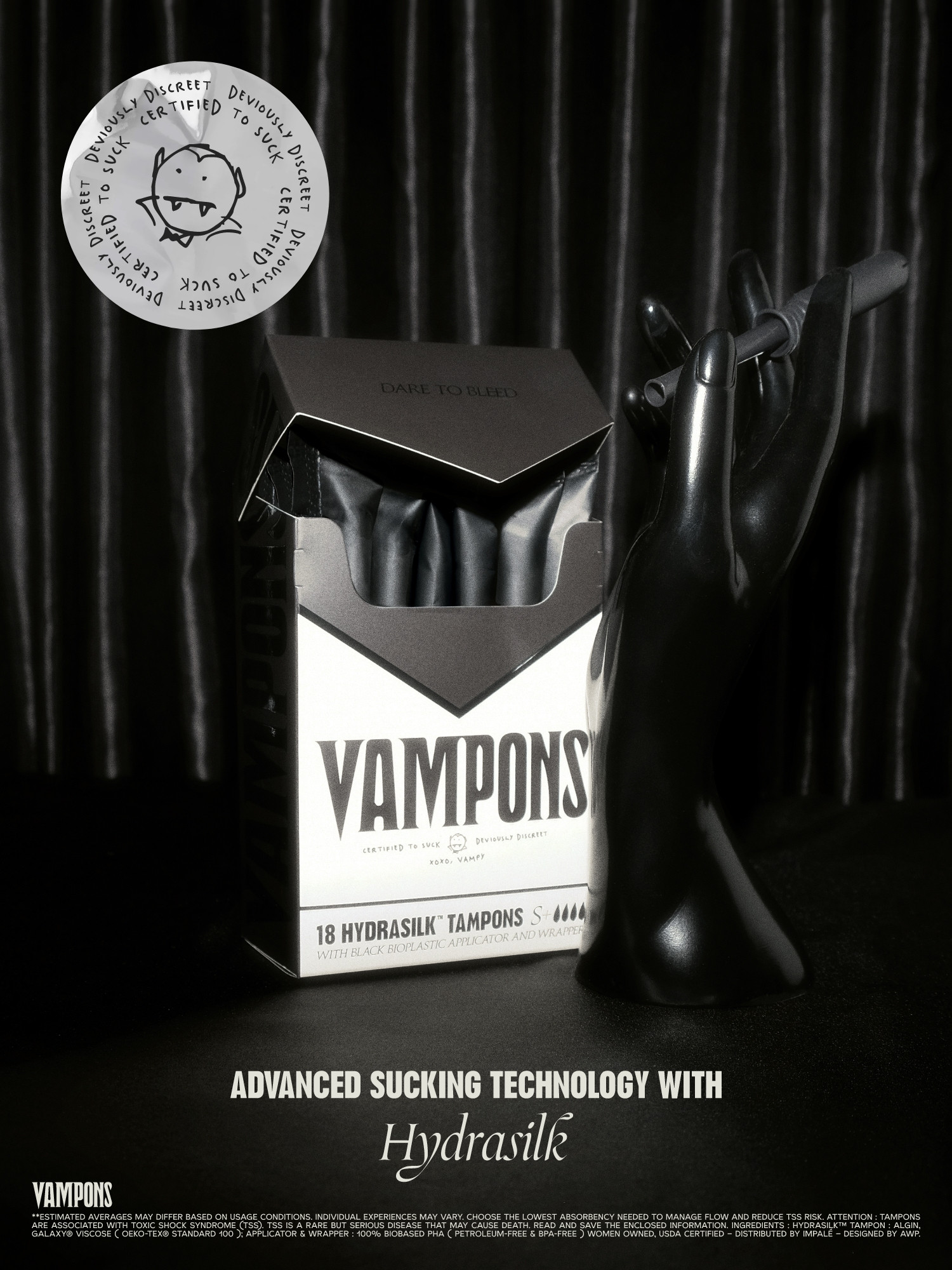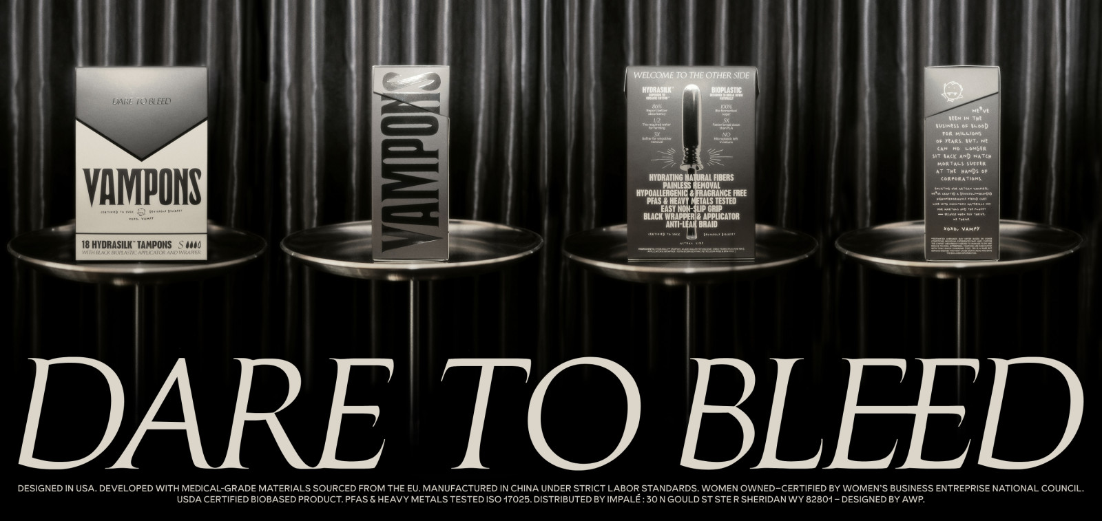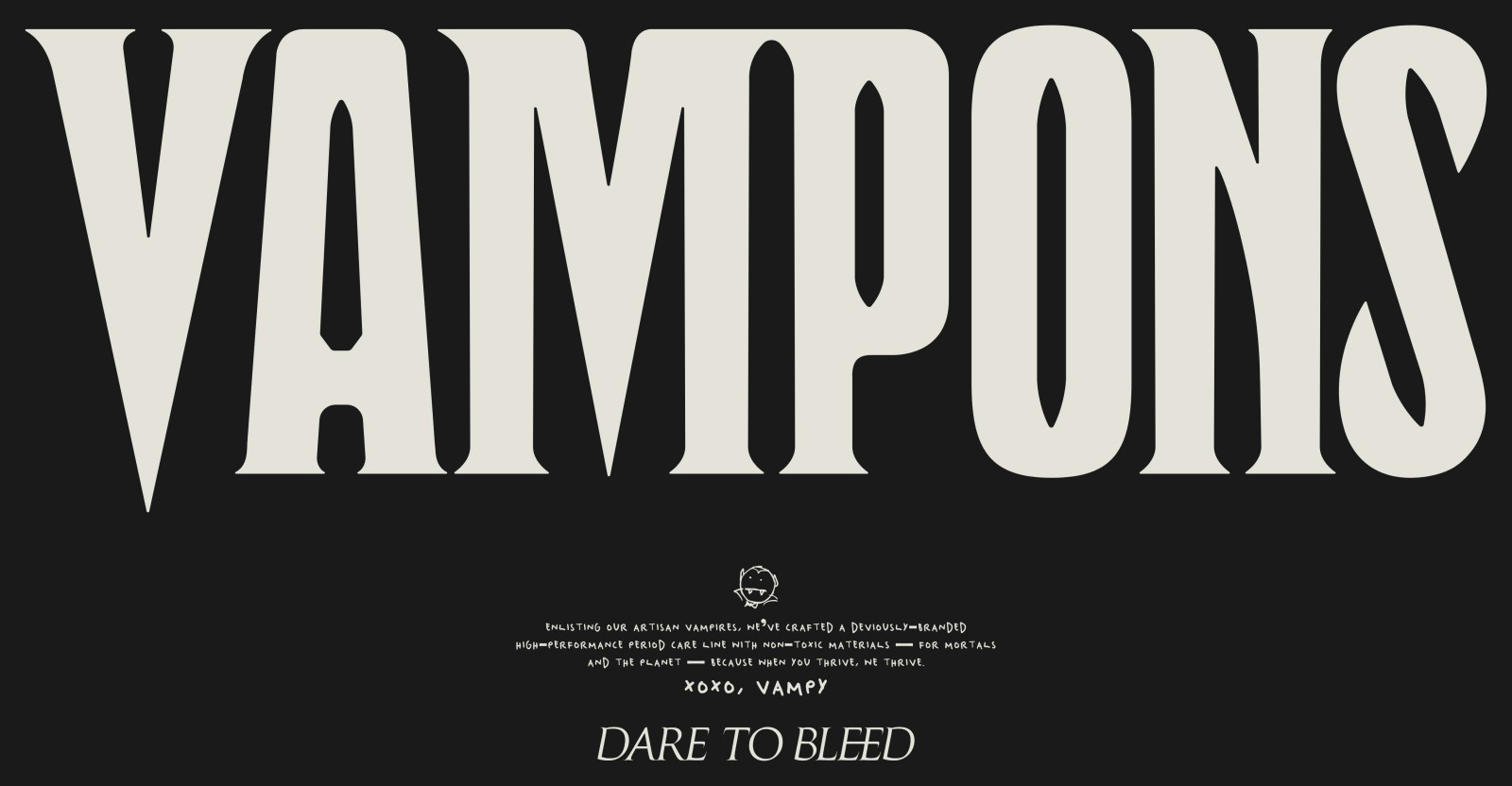

to Bleed
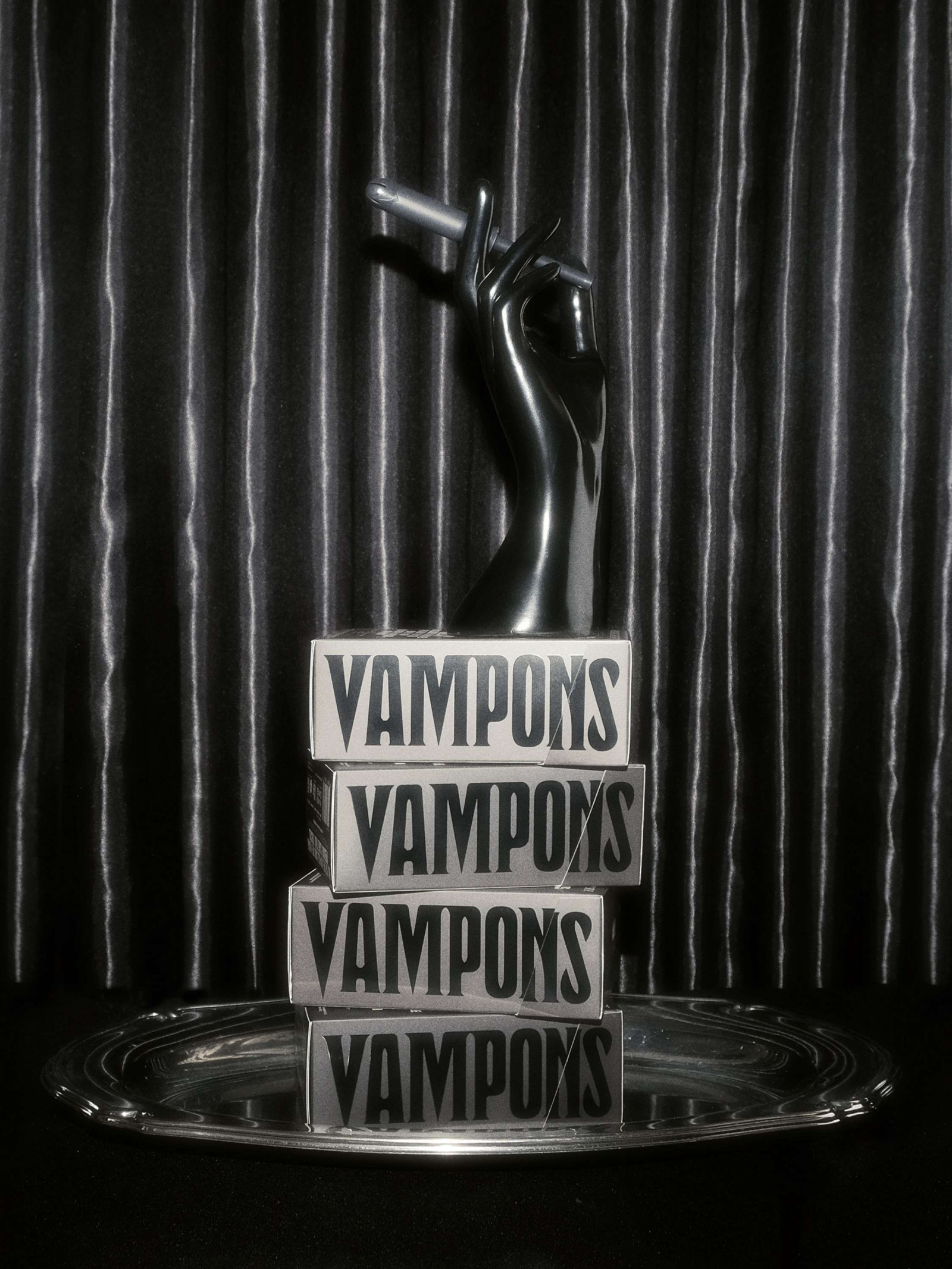
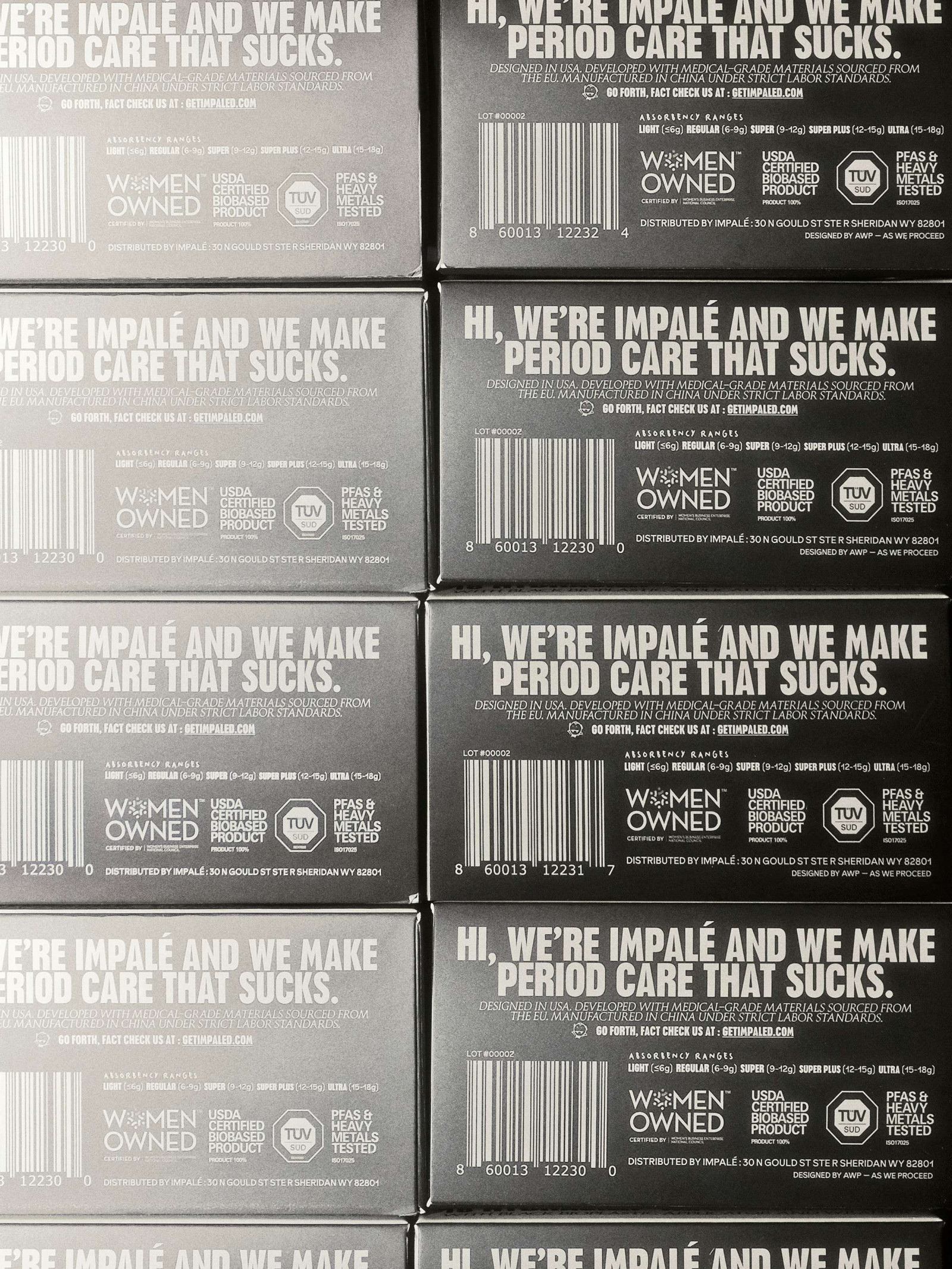
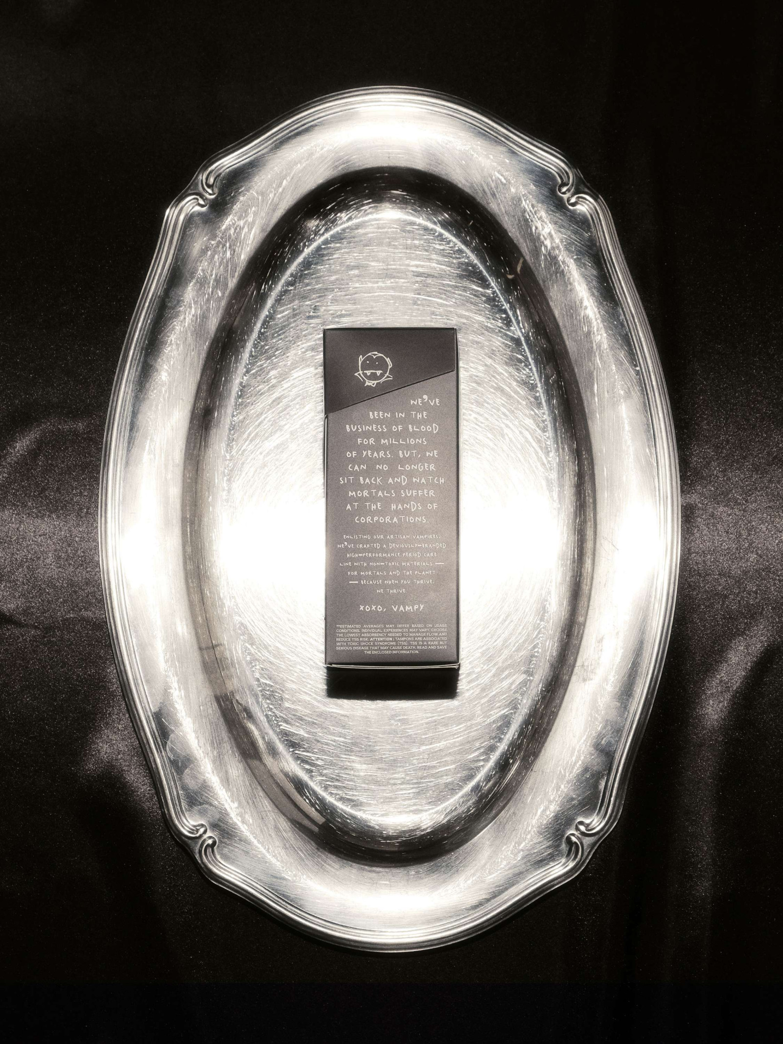
Swapping industry-standard aesthetics of pink florals for a rebellious edge, Vampons disrupts traditional period care by bringing a boldly revamped approach that normalizes monthly bleeding for uterus bearers. Embracing a contrary, ironic market strategy, these proudly non-toxic tampons—beneficial for both people and the planet—are thoughtfully packaged in a classic cigarette-inspired box, a notably toxic product.
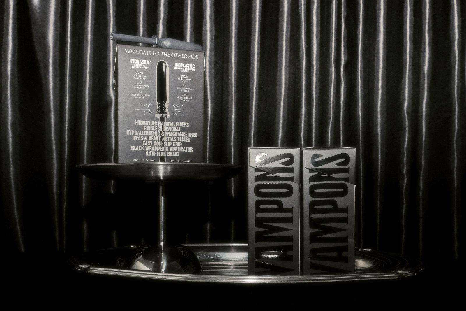
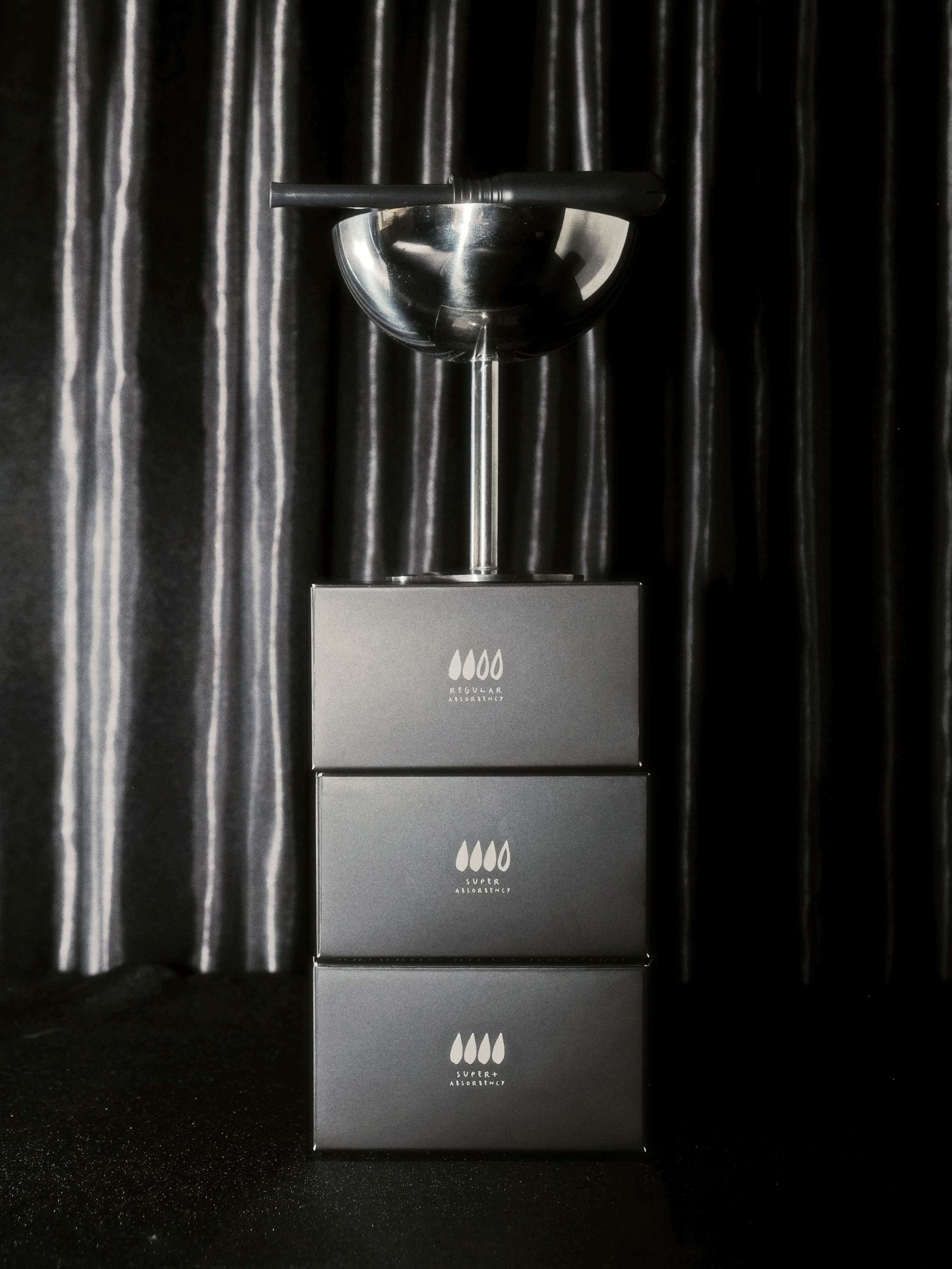
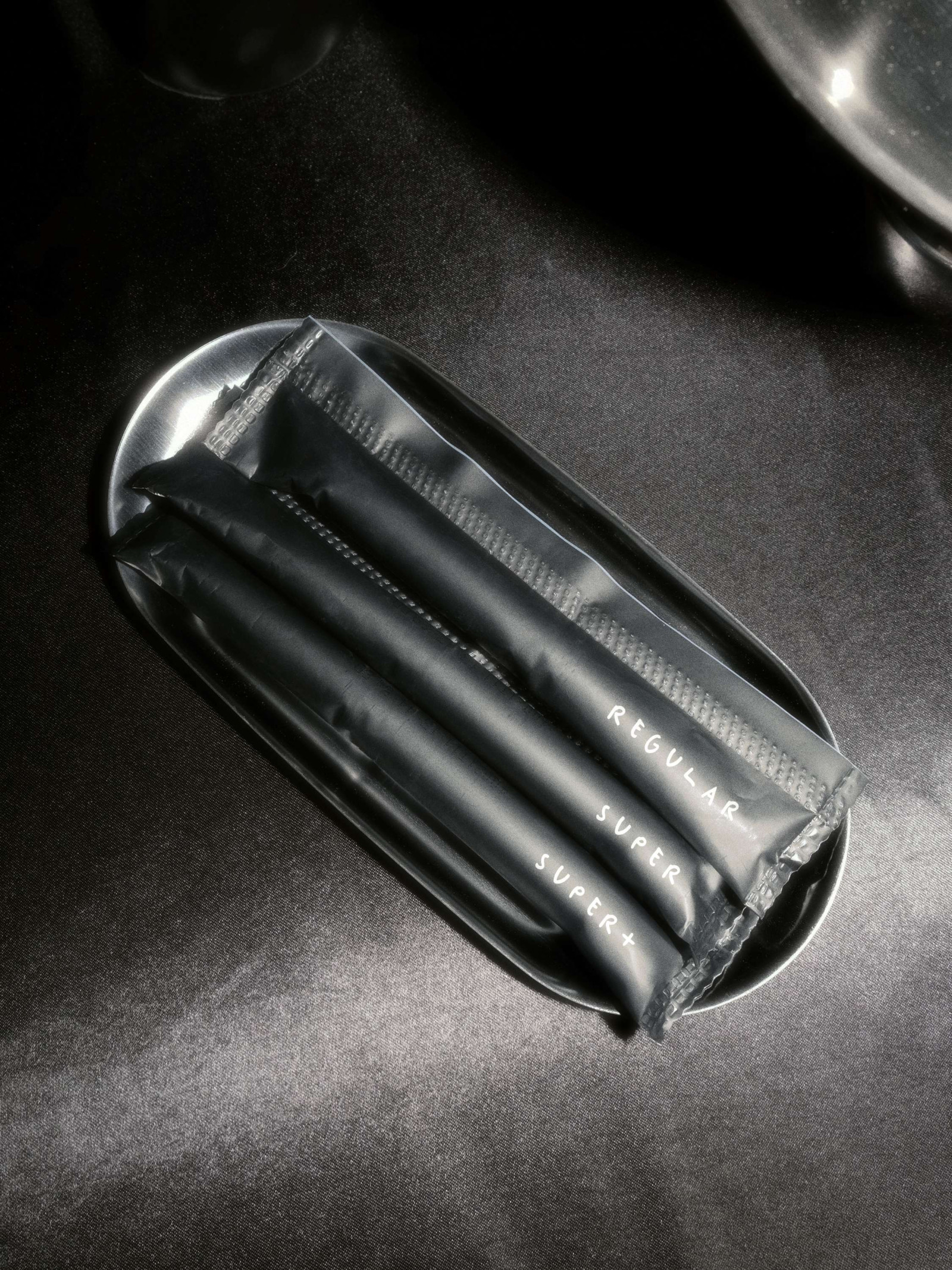
The front features an iconic V-flap that opens to an easy-access aperture, revealing a neat stack for quick grabbing and sharing. The back, designed like a grunge-rock poster, centered around a real-sized applicator, captures the brand's unapologetic spirit and straightforward approach. Deviously discreet, the low-contrast palette of black shades and off-white is emboldened by a dark glossy treatment, creating a premium product users will be proud to carry in any shop aisle. This audacious design, paired with a clear information system and cohesive product experience, actively champions a new dialogue about periods.
Featured article on The Dieline / It's Nice That
Art Direction, Brand Identity, Packaging, Tone of Voice